Color Palette
#1c6c5f (Pine Green):
This color choice embodies the adventurous spirit of the app, evoking a sense of exploration and discovery among users as they navigate through the educational quizzes and challenges.
#669788 (Zomp):
As users engage with the app's content, the sage green color scheme fosters a connection to the lush greenery and serene landscapes found in and around Vancouver, fostering a sense of calm and mindfulness.
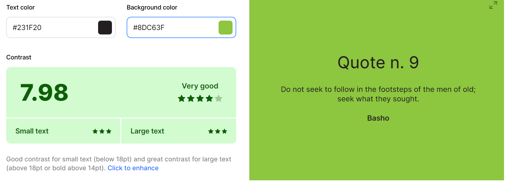
#8dc63f (Yellow Green):
This vibrant color injects a burst of energy into the app's interface, encouraging users to actively participate in quizzes, challenges, and educational activities, enhancing their overall engagement and enjoyment.
#98ff88 (Screamin' Green):
The light green hue symbolizes the app's transformative impact, inspiring users to gain fresh knowledge, broaden their horizons, and cultivate a deeper appreciation for the city's history, culture, and landmarks.
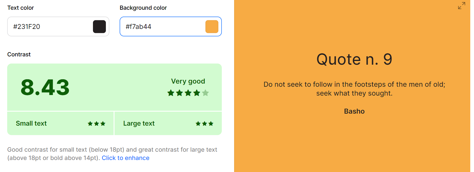
#f7ab44 (Amber Orange):
This vibrant color injects a burst of energy into the app's interface, encouraging users to actively participate in quizzes, challenges, and educational activities, enhancing their overall engagement and enjoyment.
#8dc63f (Orange):
As users engage with the app's interactive quizzes and challenges, the amber orange color scheme ignites a sense of excitement and curiosity, fostering a playful and immersive learning experience that captivates their attention.
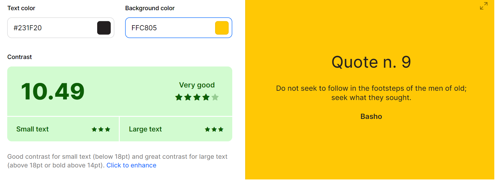
#ffc805 (Mikado Yellow):
The sunny yellow hue infuses the app with a sense of warmth and optimism, creating an inviting and welcoming environment where users feel motivated to embark on their educational journey with enthusiasm and eagerness.
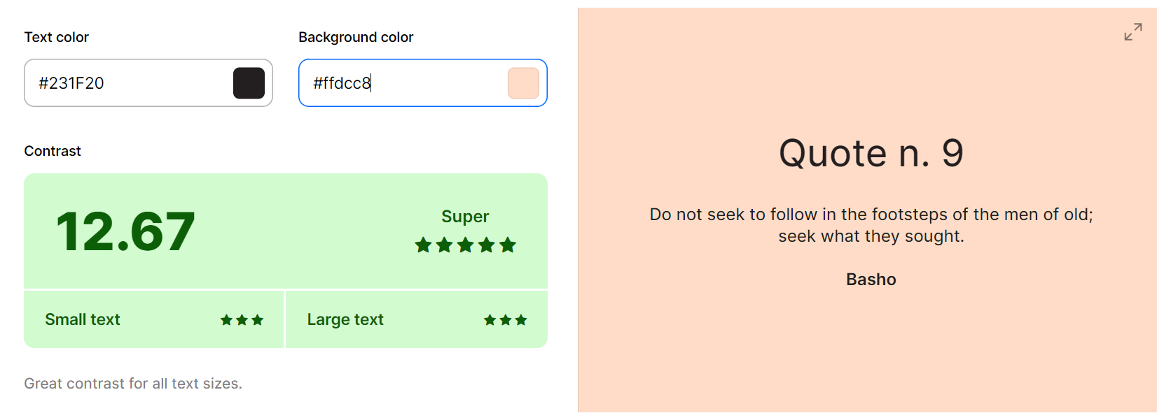
#ffdcc8 (Apricot):
This soft and delicate color palette evokes a sense of comfort and familiarity, creating a safe and supportive space where users can explore, learn, and grow together, forging lasting memories and friendships along the way.
Default State Button

The is the main button color style for our app. We chose the bright yellow color because that stand out to the user and provides a fun adventurous feel.
Hover State Button

This is the hover state for our main buttons. We chose the primary green color as we wanted to represent the theme of our adventure app.
Quiz Option Default State
For our quiz section this color is the default unselected options. We chose this color due to its subtle non-assuming nature.
Clicked On Quiz Option
This is our selected option for our quiz color. We chose the yellow due to its stand out appearance to give the user a clear indication of chosen choice.
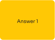
These are our dialogue boxes which feature our colors from our chosen palette.
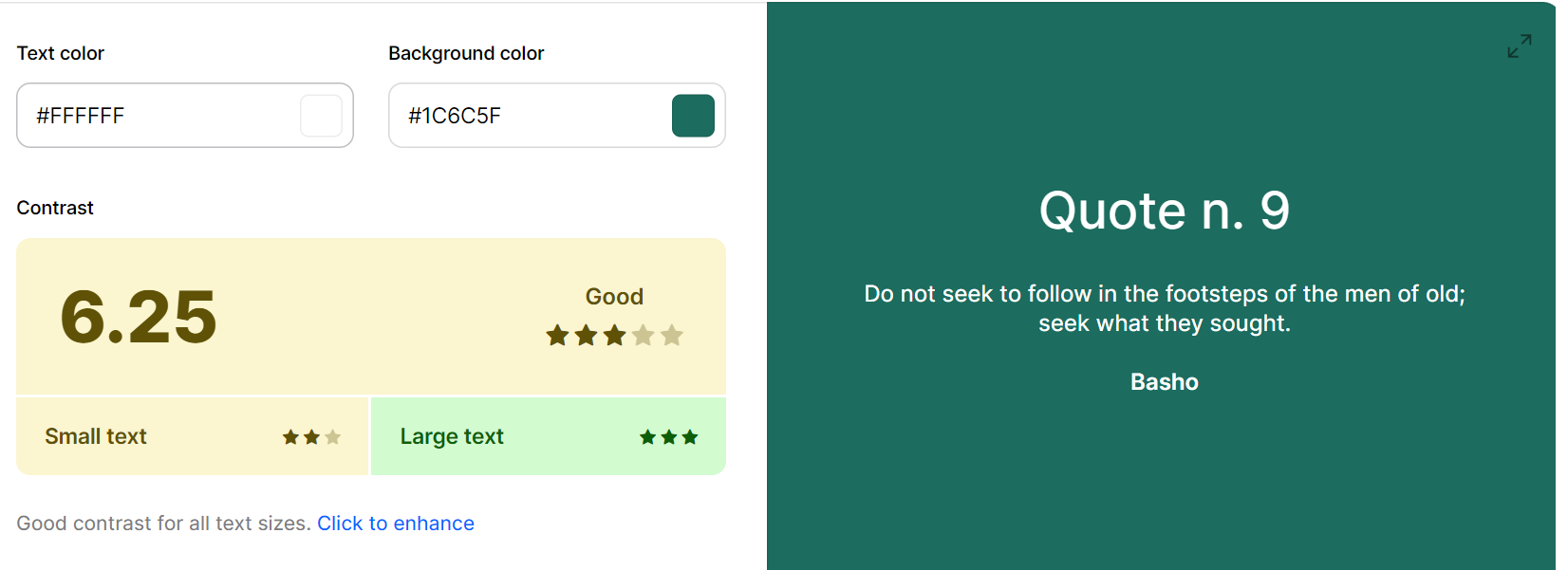
On our top card, we mainly Use white or Mikado Yellow as text on Pine Green background. we Use it to specify the titles of pages as well as for a short description on the pages.
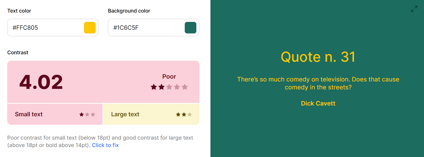
The navgiation icons on the top of the app will also be the Apricot color on Pine Green as well. Though the combination of Mikado yellow on Pine Green does not do well on smaller text we are only using it as a page title for each page of the app in a large size.
Acessibility
In our app we have different cards with our normal black text on them our of all 5 backgrounds including regular backgrounds and special cards such as quiz cards and FAQ cards,all cards scored over 7 indicating that all combos have a good contrast and is appropriate to use for both large and small text.