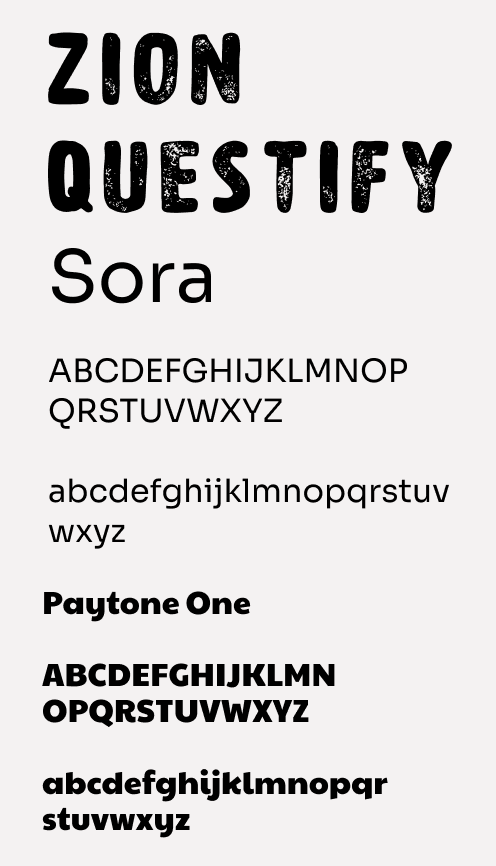
Sora
Primary Typeface
For the logo, we chose the "Zion" font as it captures adventure, ideal for Questify's playful and educational exploration theme.
For the content of the app, we are using "Sora". Sora is designed to be highly readable, even on small screens like those of mobile devices. Its clean and well-defined letterforms ensure that text is easily legible. The font offers readability and use-friendliness as it is sans-serif, enhancing user experience and app's inviting atmosphere.
PaytoneOne's boldness enhances accessibility and usability, ensuring clarity and easy navigation for important headings and menu text in the app.
Page Headings and Titles
ABCDEFGHIJKLMNOPQRSTUVWXYZ
abcdefghijklmnopqrstuvwxyz
H1
36px
Heading One
Primary Typeface
ABCDEFGHIJKLMNOPQRSTUVWXYZ
abcdefghijklmnopqrstuvwxyz
H2
20px Bold
Heading two
H3
16px Bold
Heading three
paragraph
16px
paragraph


Home
About
FAQ
Quest
Learning
Settings
For the making of the icons we understand that inorder to create a good UX we need to ensure that icons/ positions and everything we design fits the user percieved usbility. We did a brief research of what a few competitors tend to use for their icons and these are the icons we had decided to use for our app.
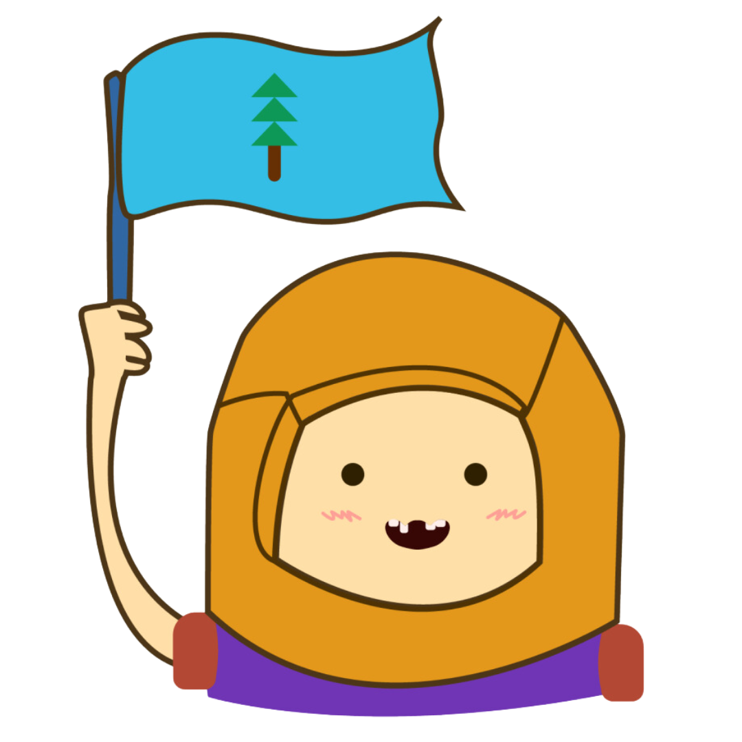
This is Jayc, Questify's very own mascot!
Jayc embodies the spirit of adventure and learning. With his yellow helmet and blue flag featuring a tree emblem, Jayc symbolizes the journey of discovery that users embark upon when using our app.
The yellow helmet represents optimism, energy, and enthusiasm, encouraging users to engage with our educational content with excitement. Meanwhile, the blue flag with a tree emblem signifies Vancouver's natural landscapes and green spaces. Together, Jayc's colors create a visually appealing representation of our app's mission to educate and inspire users about Vancouver's cultural and natural heritage.